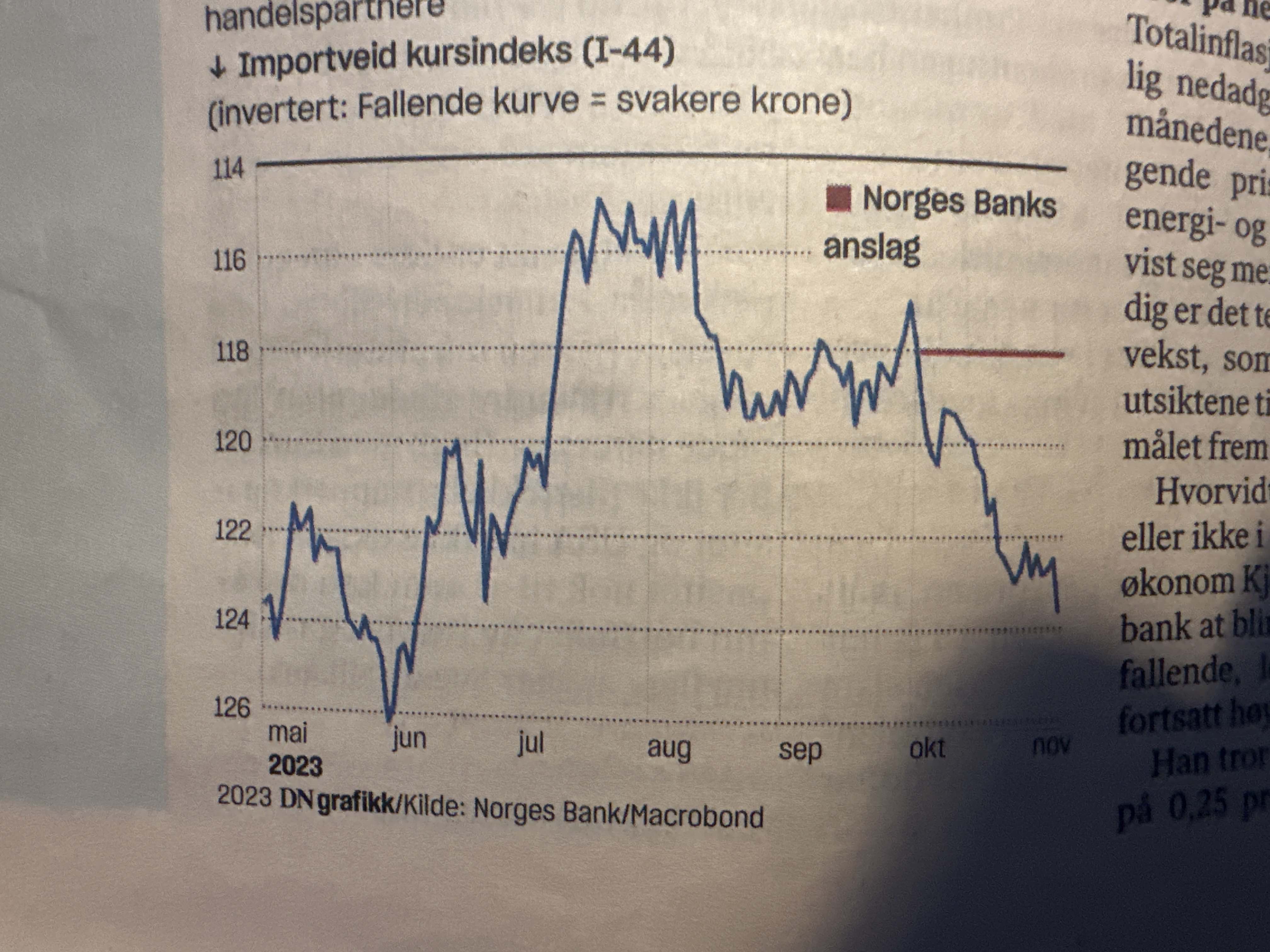
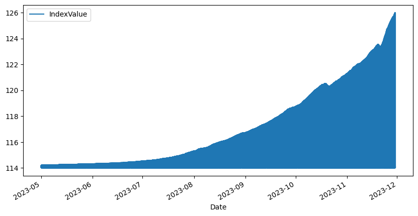
For whatever whimsical reason, as I read the financial paper, I got the idea to take a picture of one of the plots and ask ChatGPT to extract the data. My naive expectation was that the image processing function would just wing it and give me a few “eyeballed” observations from the plot.
Not so. Instead of eyeballing it, it created close to 100 lines of python code that read the image, did contour analysis, and combined it with some observations from the image such as axis (min/max on both axis). And then it went on to run it, and give me a CSV to download. I was thuroughly impressed. Looking at the data lessened my impressedness: The data bore no resemblance to the graph in other aspects than belonging to the correct domain - which only proved that it had been able to read the axis labels. But there was nothing inherently wrong with the approach. The code it had produced ran, the method was sound, and it produced the right kind of output. Just not the right result.
At the heart of the script was an assumption that the plot line would be picked up as a continuous high-contrast section by the image contrast algorithm. This is a big ask of a handheld image of a newspaper plot.
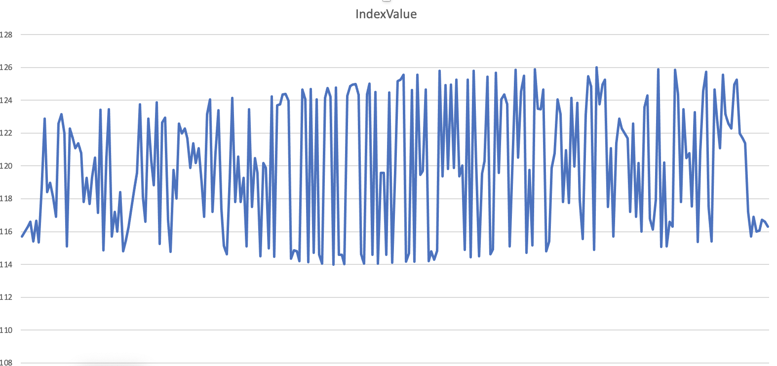
The CSV file ChatGPT returned showed no resemblance:
The code 🔗
While the result was less than I had hoped for, the code it had produced was quite good.
import cv2
import numpy as np
import pandas as pd
import matplotlib.pyplot as plt
from skimage import io
from skimage.color import rgb2gray
from skimage.filters import sobel
from skimage.measure import find_contours

# Load the image
image_path = '/mnt/data/photo-28900D53-C357-4DBC-9BDC-4D636D4059E2.jpeg'
image = io.imread(image_path)

# Convert the image to grayscale
gray_image = rgb2gray(image)

# Apply a sobel filter to the image to find edges
edge_sobel = sobel(gray_image)

# Find the contours on the sobel filtered image
contours = find_contours(edge_sobel, 0.2)

# Filter out small contours and assume the largest is the graph line
contours = sorted(contours, key=lambda x: -len(x))
line_contour = contours[0]

# Assuming the x-axis represents the time from May to Nov (6 months)
# and the y-axis represents the index from 114 to 126 (12 units),
# we'll map the contour coordinates to this scale.

# Find the limits of the x-axis on the image
x_min_image = np.min(line_contour[:, 1])
x_max_image = np.max(line_contour[:, 1])

# Find the limits of the y-axis on the image
y_min_image = np.min(line_contour[:, 0])
y_max_image = np.max(line_contour[:, 0])

# Define the limits of the x-axis in terms of date range
x_min_date = pd.Timestamp('2023-05-01')
x_max_date = pd.Timestamp('2023-11-30')
months_range = (x_max_date - x_min_date).days

# Define the limits of the y-axis in terms of index values
y_min_index = 114
y_max_index = 126

# Scale the contour coordinates to the actual data range
data = []
for y, x in line_contour:
    # Scale the x coordinate (time)
    x_relative = (x - x_min_image) / (x_max_image - x_min_image)
    days_from_start = x_relative * months_range
    date = x_min_date + pd.Timedelta(days=days_from_start)

    # Scale the y coordinate (index value)
    y_relative = (y - y_min_image) / (y_max_image - y_min_image)
    index_value = y_min_index + (1 - y_relative) * (y_max_index - y_min_index)

    data.append((date, index_value))

# Convert the data into a DataFrame
df = pd.DataFrame(data, columns=['Date', 'IndexValue'])

# Sort the data by date (as the contour may not be in order)
df = df.sort_values('Date')

# Save to a CSV file
csv_path = '/mnt/data/extracted_graph_data.csv'
df.to_csv(csv_path, index=False)

csv_path
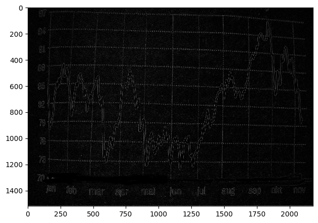
I tried tweaking the threshold value (0.20) and a few other settings to no avail. The sobel function spit out an image where the line plot was hard to discern:
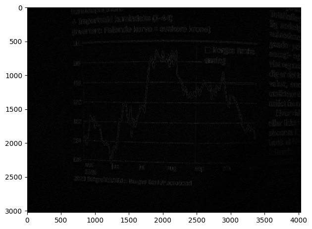
Filtering out blue to try to isolate the line color was no help.
Attempt #2 🔗
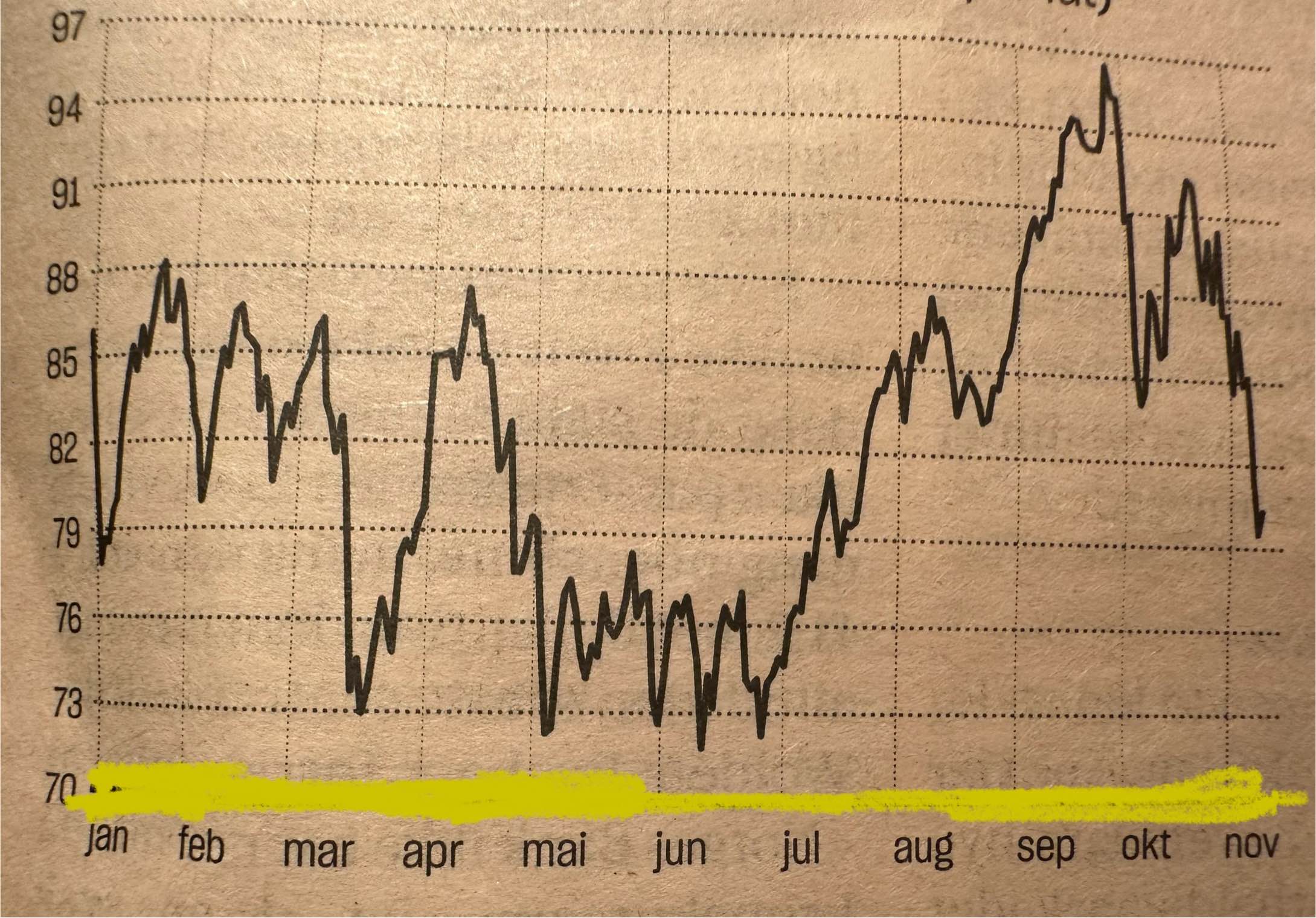
I took an image of a different plot that had a little higher contrast, colored over a particularly high-contrast axis bar, and tried to feed it through.
Original
Sobel
Result
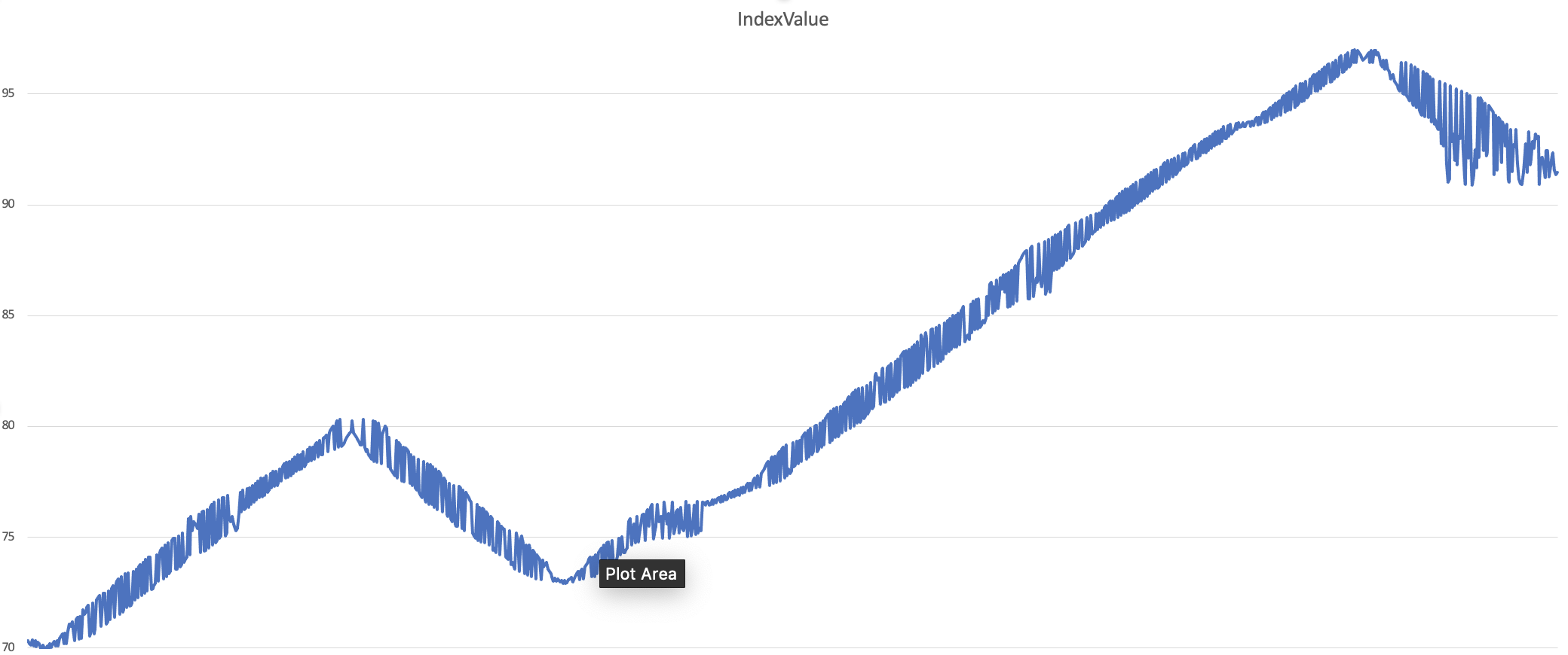
With a lot of goodwill, you can make out some features of the original plot here. It is nowhere near useful though.
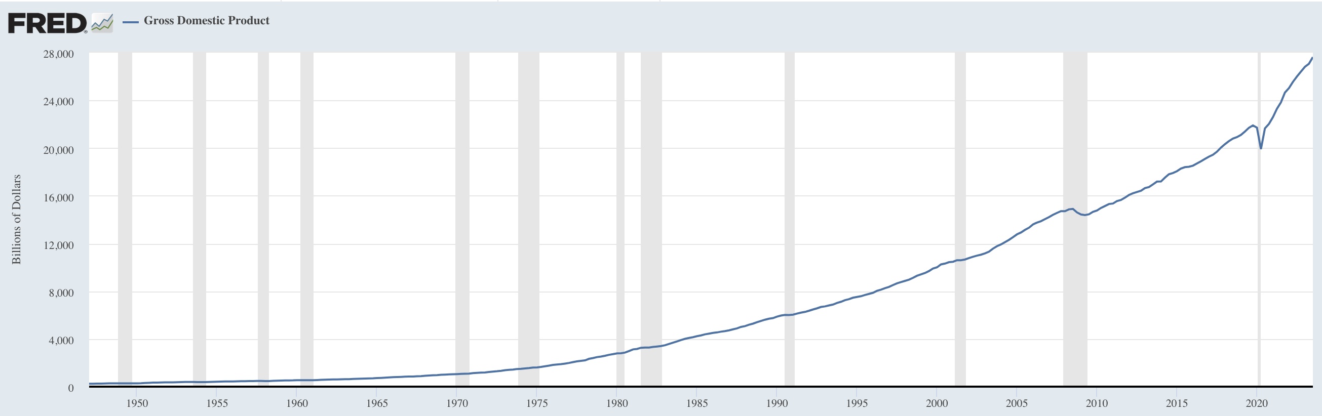
While I was starting to wonder if this thing worked at all, I figured that one possibility was that the images contained too much noise for the simple filter to work. So I proceded to test with a plot I found online.
Does this thing work at all? 🔗
In economist-circles, a lot of plots from St. Louis Fed’s FRED database circles. They are very distinctive, always plotting a singe metric against a time axis while highlighting recessions.
So I went for a plot of GDP since 1950.
Original
The sobel filter didn’t look overwhelmingly promising, but there was indeed a lot less noise than in the previous images.
Sobel
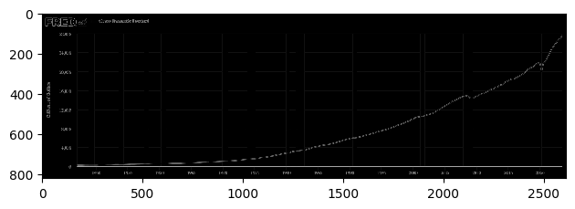
This time though, the algorith was able to extract the basic shape of the plot, and reconstruct it to a fair degree.
Result
You might notice that the axis are completely off in this plot, but that is no fault of the algorithm. The axis are hardcoded, and left there from the original plot. It was ChatGPT that hardcoded them.
The important thing is that you can make out the shape. Curiously, when handing the plot to ChatGPT and telling it to extract the data from that graph, it recognizes it is from FRED and tells me to download the CSV directly instead.